B-Cycle
Team
Company | Institution
Category
Type
Project description
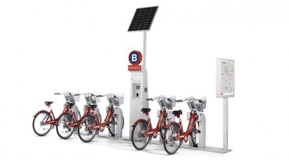
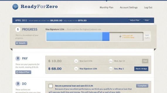
B-cycle is a next-generation bike-sharing program. It is a zero-hassle, zero-emissions way to get around town. It’s a bike-sharing program that meets the transportation, health, and environmental needs of our communities. One that adapts to any size city, corporation, or campus. It’s free and spontaneous, but also practical. Imagine a network of bike stations located within a few blocks of one another throughout your community. As a member, you can unlock any of the specially designed bikes at any station and ride it to any other bike station. Fast, simple, and inexpensive. B-cycle is also the only bike-sharing program that measures the actual distance traveled on each ride and keeps track of the calories you’ve burned and the carbon emissions you’ve prevented. All this information is available on your personal B-cycle web page. Sustainable design that frees you from your car and is optimized for the needs of urban living, B-cycle is a new transportation future and it’s available now.
Context
When developing this system we made it our goal to be best in class for brand, product and digital experience. To do this we designed with a holistic approach: developing these three aspects in unison, giving equal consideration to each from the beginning.  We evaluated other bike sharing systems, both large and small. We looked at strengths, fallacies, how systems were sited on the streets, how people experienced the systems, what worked well, what didn’t.
Our Cultural Anthropologists also explored the travel habits of our audience looking for tensions and opportunities to disrupt established behaviors. Based on those findings we decided to primarily focus B-cycle on quick trips that are too short to drive a car and too long to walk. We worked to make our system noticeable, accessible, simple to use and unintimidating. Beyond that we wanted to make sure to encourage and retain each user by showing them how their change in behavior had a positive impact for themselves and the world.
From the website, to the app, kiosks and cards, B-cycle was designed to make getting around your city easier. And for those looking to help the environment while improving their own health, Bcycle provides an answer.
Impact
What started as an experiment in Denver has now become a thriving business with installed B-Cycle operations in 11 cities including Chicago, Louisville, San Antonio, Madison and Ft Lauderdale. This has been made possible by both the product and the brand being built specifically to be adaptable for partnering with cities and sponsors. The product is modular, the logo is modular and the brand is modular.
We have also seen B-Cycle change the cultural conversations in these cities around biking as a viable alternative to cars. In the press, social sphere, and coffee shops we have managed to spark a true dialogue with the public and politicians about the future of America’s streets and urban designs. In the end, our hope is that all of our design decisions have culminated in a system that will normalize biking and leverage it to help solve some of the environmental, health and congestion issues we face today.
Craft
We like design to be visually powerful, intellectually elegant and above all timeless. Something familiar yet new. This approach set the tone for the project. Every design decision would have meaning, nothing would be arbitrary. For the bikes we focused on utility and security. Larger baskets to allow for laptop bags, onboard GPS units enabling more intelligent bike distribution, and intelligent cable locking systems were but a few of the innovations we focused on for launch. The form factor of the stations took some of its inspiration from old gas pump designs. This worked well as it leveraged something we are all familiar with yet put a new modern interpretation on it.
Functional considerations included designing a walk-thru structure that was resilient, durable, affordable to produce, and modular enough to fit the installation needs of a variety of unique urban environments. Subtle color and sound cues offered positive reinforcement for desired behaviors, and all design decisions focused on lowering barriers to entry and engagement times. The website has been designed with few colors and limited content to reinforce the simplicity of the system, which has helped with scalability across the network of regional B-cycle operations.

