Ford SmartGauge
Team
Company | Institution
Category
Type
Project description
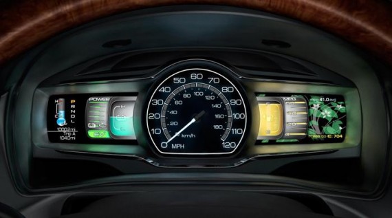
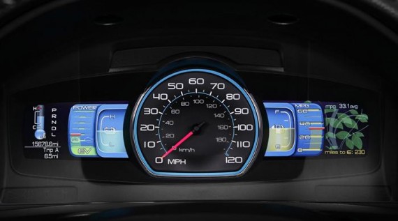
SmartGauge is Fordʼs first LCD screen instrument cluster, built into their 2010 hybrid sedans. Our goal was to effectively modify the behavior of the driver to achieve the optimal fuel efficiency. And do this without distracting the driver by actually reducing visual demand. Working with the simple truth that hybrid enthusiasts want to get the most from their new cars, we proposed to Ford ways to help drivers understand how their behavior affects their fuel economy over time. We also used cognitive visual research in color shape and form to create a safer instrument cluster that was easier to read in peripheral vision. We delivered an experience that was more effective, safer and, most importantly, FUN. In the past, hybrid drivers have been disappointed with their actual mileage not meeting the advertised rating. When it comes to fuel economy, the secret is that how a car is driven matters as much as how a car is designed. For the first time, SmartGauge puts the information needed to drive efficiently behind the steering wheel. Re-envisioned hybrid-focused gauges help drivers better understand the rhythm of hybrid driving, and how small changes in driving style can result in big savings at the pump.
Context
Ford rarely uses outside consultants, but this time they needed assistance developing an interface that delivers better performance and “emotionally connects” with drivers. Knowing that design could influence behavior, our approach was simple: Ford would optimize the efficiency of the car, we would optimize the efficiency of the driver. We proposed that driver interest in efficiency is situational. Even ʻhyper-milersʼ can be late for work. Others may be more interested in being efficient on longer trips.
Unlike mechanical gauges, LCDs have an ability to change and adapt. This had a direct effect on our design, and transformed a nagging system, always trying to push or teach, to a system that responds and adapts to the driver and driving conditions. Fordʼs team developed a new algorithm to measure total fuel efficiency in the car. (Lots of factors – hills, braking style, air conditioning, etc., can affect mileage.) This enabled us to develop the most discussed design element, the “Efficiency Leaves”, which represent total, longer-term, vehicle efficiency. This key element has had the most emotional connection with drivers, making it exciting and encouraging as they watch their efficiency grow (literally) with better driving.
Impact
The most significant idea, proposed and developed by our team, is that the gauge design can increase mileage. We presented Ford the concept of using design to “influence driving behavior”. This is a unique concept to Ford, and to the automotive industry. And the results and, more importantly, driversʼ experiences are clearly supporting this premise. In addition to being named Motor Trendʼs 2010 Car of the Year, the Ford Fusion Hybrid has been credited with lifting Fordʼs sales numbers by 46% year on year. Remarkably, the Fusion Hybrid also delivered 82% “conquest sales” to Ford, bringing new drivers into the franchise.
Ford posted a $6.6 billion net profit last year, the highest since 1999, and overtook Toyota to regain its position as the US’s number two carmaker behind GM. Rated by the EPA at 41 mpg (the EPA doesnʼt consider driving behavior in their procedures). With SmartGauge drivers are exceeding 50 mpg. Ford has adopted our phrases “influencing driving behavior” and “coaching” into its public discourse on SmartGauge. This points to the realization that, while the car makes a difference, the driver is a critical and shares responsibility for efficiency.
Craft
Building on previous research, our team immersed themselves in the hybrid world. We created two early concepts in Adobe Illustrator exploring how we might create a cohesive instrument cluster out of two screens and a physical speedometer. The concepts were built in Adobe Flash, hooked to a dataset of a recorded drive to simulate the car in operation. We evaluated the gaugesʼ readability and helpfulness as related to efficient driving. The PC-based prototypes were then shared with drivers for usability and preference. Prototypes were also evaluated in glance tests to simulate the typical driverʼs 0.2 second glance, to gauge real-world readability.
We rebuilt the selected concept using Presagis VAPS, a sophisticated instrument cluster software suite used more often for aviation. This VAPS prototype was loaded into a real car in Fordʼs VIRRTEX 360° driving simulator, where drivers evaluated the display. Translating physical gauges into digital form allowed us to push the envelope in readability and safety. For example, traditional needle gauges require a direct focus. Instead we used areas of contrasting color, which can be glanced at quickly and processed while looking at the road. This is really the first automotive gauge “designed to be read without being looked at.”

