Adobe Kuler iPhone App
Team
Company | Institution
Category
Type
Project description
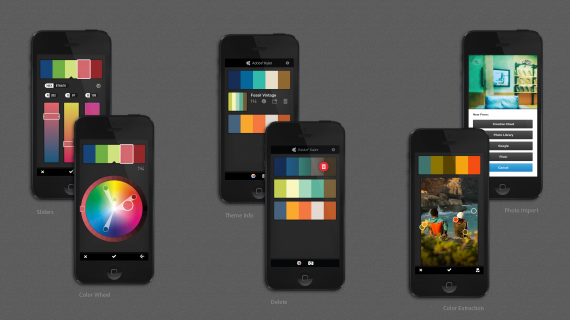
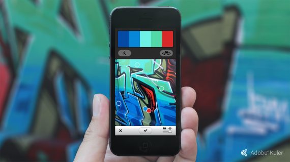
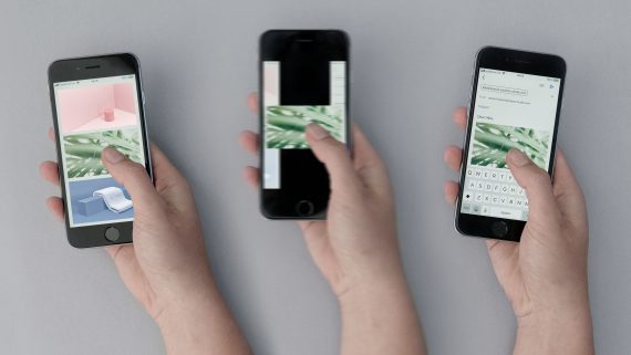
Inspiration doesn't always come when sitting in front of a computer screen. Sketchbooks are great for capturing ideas, but not so much for sampling a color. Kuler wanted to address this by giving people a tool they could use 'out in the field' for sampling, creating and editing color themes. Having the tool on a phone means that inspiration can be captured at any time and from anything - even a source that appears to be colorless.Creating color themes in a fun and engaging way allows everyone the freedom to explore and interact with the world around them with new eyes. Kuler's purpose is to facilitate access to the inspirational nature of color, and bring joy to its users as they explore the colorful world around them.
Context
Kuler has existed as an app on the web since 2006, so we had a fairly good understanding of our user’s habits and needs. We knew that the user base of the web RIA was pretty much split into two equal groups: Designers and Creators. In our research, we found that the people who downloaded and used the color themes the most (Designers) were not creating themes themselves. They used Kuler as a resource for inspiration for their designs. The other group, the Creators, were the ones who were crafting color themes for the sheer fun of it, recognition and accomplishment. These Creators were (mostly) not designers themselves, but people from all walks of life who shared a passion for color. We didn’t view this bifurcation as a problem to solve, but rather a natural and organic outgrowth of our user’s diverse and legitimate needs. However, as we began looking at creating a mobile app for Kuler, it became apparent that by focusing the experience on capturing color we could draw in and engage the Designers and delight the Creators at the same time – therefore creating something that would be useful and fun for both types of users.
Impact
App Store:
150k+ downloads in the first 4 days.
Featured under “New and Noteworthy”.
Reached #40 in All Time Free Apps.
Rated 4+ with over 170 reviews.
Awards:
FWA Mobile of the Day, Aug 6th, 2013
Press:
Wired Magazine (@Wired) tweeted: “Adobe’s Kuler iOS app is a must-have for color and design fans. We’ve been nerding out over it for days!”
Creative Bloq (creativebloq.com) named it the #1 best iPhone app for designers.
Featured on Forbes.com, Engadget, MacRumors, The Next Web, and 9to5Mac.
User Reviews:
“Well this just changed everything that i will ever do” (5 stars) – Tim Chrepta
“Amazing. With out a doubt, THE definitive color palette app. Had it for 20 minutes and used it in a project already… highly recommended.” (5 stars) – HV Ads
“Almost perfect! Color capture in real time? Synched straight to my Adobe account? What’s not to like?” (5 stars) – oycomics
“Thank you. This app was needed… As a developer this will come in handy and be used daily.” (5 stars) – Acctman
Josh Jackson (@906graphics) tweeted: “#kuler app…wow. Best app I’ve downloaded in awhile… it’s perfect.”
Yazan Malkosh (@malkosh) tweeted: “My favorite new iOS app @Adobe #kuler. Brilliant execution IMHO.”
Craft
“XD provides experience-led innovation. We are a team of makers that set a premium on workmanship. We fight for the customer. We collaborate and disrupt. We reward risk taking. Innovation is our job. We are the experience design team at Adobe.”
-XD Manifesto
The design philosophy for Kuler was simple: make it simple. Not dumbed down and thin, but simple such that a user could understand everything they need to know in the first few minutes of interaction. That seems to be a very universal goal in our industry, but a surprisingly difficult one to effectively pull off. Much of the interactions in Kuler are purely gestural. Purely gestural interactions can be scary territory – what if they never make the right gesture? How will they ever find this functionality? The default reaction is to add in a button, tutorial, or dancing arrow as a guide. With Kuler, we fought this temptation and instead designed an app that encourages play, minimizes failure and rewards exploration.

