Magic UX
Team
Company | Institution
Category
Type
Project description
As a society multitasking on Smartphones increasingly, the way we communicate, shop, bank, watch TV and work has been transformed. Despite many benefits over traditional analogue tools, some are frustrated by the inefficiency of certain tasks and the inefficiency of moving between apps, interrupting flow and increasing the cognitive load of simple tasks. As you leave the app you are working in, your attention is focused on distracting menu systems instead of the task at hand. The average person uses 25 apps per week and one in five times they use a device, they open at least three of those apps.
As a society multitasking on Smartphones increasingly, the way we communicate, shop, bank, watch TV and work has been transformed. Despite many benefits over traditional analogue tools, some are frustrated by the inefficiency of certain tasks and the inefficiency of moving between apps, interrupting flow and increasing the cognitive load of simple tasks. As you leave the app you are working in, your attention is focused on distracting menu systems instead of the task at hand. The average person uses 25 apps per week and one in five times they use a device, they open at least three of those apps.
Inspired by how people naturally place objects on a desk or table we became curious about how a digital system inspired by human behaviours in the physical world, and felt there was a growing need for a smoother and more fluid Smartphone multitasking paradigm… so we invented one.
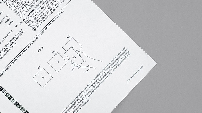
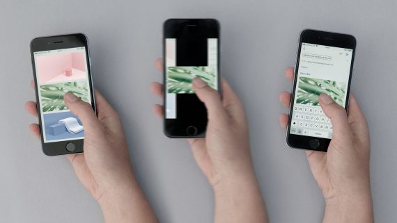
Magic UX is a spatial user interface which enables the user to recreate their real desk space on their Smartphone screen, and to move around this virtual desktop, between ‘pinned’ apps, with physical movements. You can also physically move content between apps by dragging it through space. This could be text and images, or metadata such as a time-slot from your calendar or location from your map which magically transforms into text in an email.
Multiple desktops can be created temporarily based on your needs or linked to a location, allowing you to access different Smartphone app layouts at home, at work or on the move. Magic UX uses the phone’s internal motion sensors to determine arrival at a designated app space.
This was something that we at Special Projects felt passionately about: Smartphone multitasking inefficiency was a frustration for us in our daily lives and something that came up repeatedly in interviews with users as we researched human digital interactions.
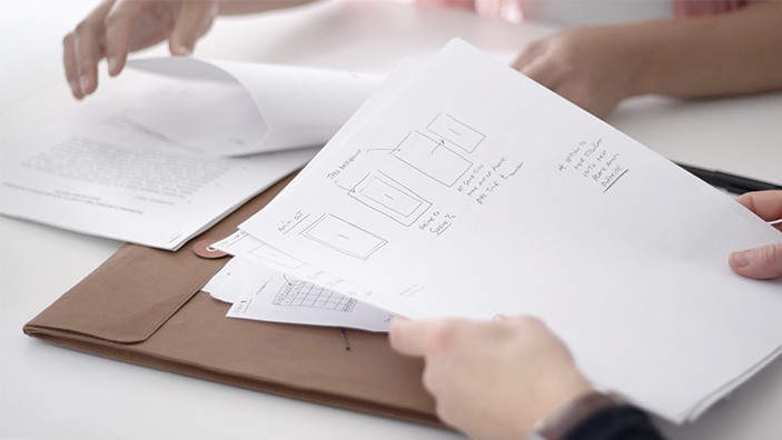
Using our user centred design methodology, we conducted in-depth interviews with a range of extreme users across different use cases as we iterated the content and found that what was needed was a solution across all apps at the OS level, something that would change the way humans interact with Smartphones in a simple, elegant and effective way. Magic UX has an instant effect on users’ daily activity, making their experience more comfortable, seamless and delightful, by saving an average of eight clicks per interaction in Magic UX.
We discovered that this was a problem many people experienced across all apps – it didn’t matter if you were writing a report for work or booking a holiday. The problem lived in the space between the apps, a sort of no man’s land.
Building on existing smartphone technologies, Magic UX is both a practical solution to the problems of smartphone multitasking and – as our physical and virtual worlds converge – a timely vision for the future of navigation in the digital realm. This is an interaction designed to become invisible and forgotten, letting you focus on the task at hand.

