Delta Brand Transformation
Team
Company | Institution
Category
Type
Project description
In 2010, airlines were disappointing customers even while they were posting profits. It was clear that something needed to change. Armed with the insight that travel can be complicated, but the tools shouldn’t be, Delta set out to transform the way people experience flying.
Context
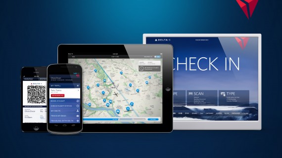
The Fly Delta platform is built to meet the needs of the modern traveler, whose experience transcends a single channel. Each product is focused on its individual moment in the journey based on the strength of the platform; the tablet app for planning an inspiration, the kiosk for entering the airport, the mobile app for running through the terminal, but together they form a cohesive and complete experience, bound by a common design language and sensibility.
Impact
Delta has been widely recognized for its digital leadership, impressing both customers and industry insiders with Fly Delta’s thoughtful tools and service. The Fly Delta App has had over six million downloads, over ten million check-ins, and over 190,000 visitors per day. In the first week after its launch, Fly Delta for iPad generated more than 100,000 downloads, was named Gizmodo App of the Day and FWA Mobile of the Day, and it skyrocketed to #1 Travel App in the iTunes Store. In the first month after the kiosk launch, Delta experienced a 15% decrease in check-in times, solely as a result of the redesigned and architected experience. The new channels are already accounting for more than 11% of digital revenue, and overall flight bookings are on the rise.
Craft
Since Fly Delta platform services a wide audience, from travel pros to family vacationers, it was imperative that the design language be clear and concise, built on a strong typographical hierarchy and a relentlessly consistent UX framework. Words and descriptions were preferred to icons or ornamentation, ensuring that even first time users could quickly understand that status of their flight or how to get their boarding pass. As the product grew to encompass more channels, the distinctive visual system and user experience served as the common thread that tied an otherwise disparate set of technology platforms into a cohesive and transcendent experience.

