Estonian ePolice Query System
Team
Company | Institution
Category
Type
Project description
We are a development team from an Estonian government organization (IT and Development Centre of the Ministry of the Interior). Our team is specialized in police systems which are used outside in the street in police cars. The development team consists of 15 members. We are entering this project into the disrupting category as the developed system is playing role in our security and the more officers want to use it the more secured our society becomes. Since 2004 Estonian police has been using a query system in their cars. 10 years is a long period for an IT system. In 2015 we started to develop a product called APOLLO, which would replace the old system. Currently our team is working on the new ePolice product which helps police officers to get information they need “in the field” without using walkie-talkies.
Challenge
The old system had two main problems. The first problem was extremely long query response time, also the implementation of new feature requests took too much time. The second problem was confusing interface because of different level data overload. A mixture of information was presented on a small 7 inch screen and more important data didn’t stand out. As the old system was slow and difficult to understand we decided to design the product so that it would be intuitive and playful to use: information would be placed on different levels and critical information would be more emphasized. To find out what kind of data officers needed in the first place and what kind of data should be more clearly presented we shadowed countless days police officers in the streets, also in the emergency control center.
The Solution
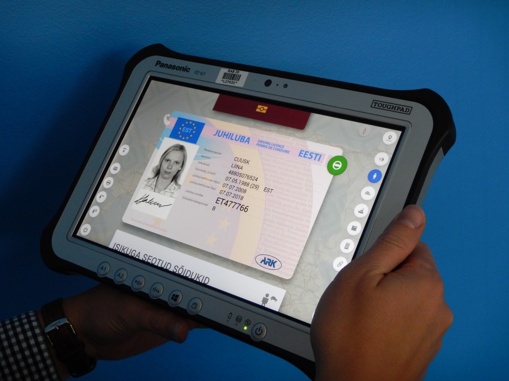
There is a common understanding that public sector, especially power structure systems, should be complicated, dull and grey colored, we tried to brake that notion and make simple and engaging interface. The data coming from different databases (identity cards, passports, visas, driver licenses etc) is represented on official document templates which ones people hand to officers. The way the information is presented makes it easy to understand without paying extra attention. No more MS-DOS type interfaces. Because of the unique and user friendly interface officers wanted to use the system more likely. As the queries became faster police officers’ time was saved and thus they were able to monitor more surrounding than waste time on watching the small fuzzy screen.

