HBO GO Mobile Applications
Team
Company | Institution
Category
Type
Project description
As more and more people were streaming content on their mobile devices HBO approached HUGE to plan and bring to market a suite of applications that would allow users access to the complete library of acclaimed HBO content through an interface that delivered the feel of the HBO experience. HBO had previously developed HBO GO as an on demand service that existed solely on HBOGO.com. HUGE's development of the HBO GO app aimed to harness the vibrant content of HBO to deliver a truly unique and seamless digital experience on the iPad, iPhone, iPod Touch and Android.HBO GO was developed to provide an ideal place for current HBO subscribers to not only view, but become fully immersed in, HBO's selection of programming. By expanding their platform, HBO Go would give more value to HBO subscribers while also creating a compelling product that could attract new subscribers.
Context
HBO GO mobile needed to be as effortless as possible for the user to be able browse through content and drop into the viewing experience with ease. The real goal was to make the content not only more accessible but more immersive. HUGE set out to develop an experience that would enhance the way subscribers already consumed HBO content, delivering it consistently across platforms, and remaining native to the device in use. With over 1400 HBO shows and movies available HBO GO needed to illustrate the depth and exclusivity of HBO’s content.
HBO GO launched in April 2011, at a time when many people were embracing the notion of cord-cutting and starting to think differently about how they consumed TV. HBO could now better demonstrate a value to their subscribers by providing them with the means to access HBO wherever and whenever they wanted, giving them complete control of their viewing experience. HBO GO provided the distribution their subscribers were looking for, as well as new ways to engage with their content.
Impact
The HBO GO app really serves as a game changer to both HBO subscribers and HBO as a company. The app is a significant value add to their existing subscription and allows users to experience HBO content anytime, anywhere at their convenience. The interface enables the enjoyment of the programming users already know and love as well as providing a platform for discovering new content, to both engage and retain subscribers. The app indicates a significant investment on HBO’s part to steer their customers to use the streaming service and for making their content available almost anywhere. The app is one of several digital offerings from HBO that demonstrates how they have adapted to changing technology and the evolving behaviors of their subscribers.
Upon launch HBO GO received extensive press coverage and impressive user response and adoption. The HBO GO mobile app made its way to the top-ranked free app in Apple’s App Store on its first day of release and received 1 million downloads within its first week and 3 million downloads within the first month. The success in the App Store and the outpouring of customer reviews served as a goldmine of data for future iterations.
Craft
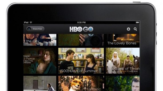
HBO produces the most sought-after programming in the world and HUGE set out to create a design that would showcase that. We needed to make the UI transparent enough so the content could really shine. We also wanted to have a consistent experience across all devices. We tried more than 25 homepage options and prototyped the best ones to be sure we had the right solution. The winning design was one that exposed everything in an endless panning grid instead of hiding the content in a traditional carousel.
On the iPad app the main interface features a stunning mosaic like grid of captivating images from the various HBO programs. Some squares in the grid show mini videos playing to tease content. The app allows users to begin watching the full length content from within the initial experience, minimizing click through and maximizing usability across the various devices. The display allows users to both view the entire breadth of content and to easily immerse themselves in their desired selection. The app features a “Watchlist” that keeps track of bookmarked content for later viewing; bonus content including interviews, recaps and behind-the-scenes extras; social media integration and other forms of commentary; and more.



.png)
