Gallery One
Team
Company | Institution
Category
Type
Project description
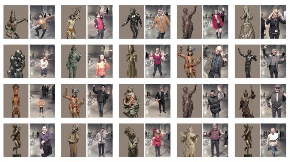
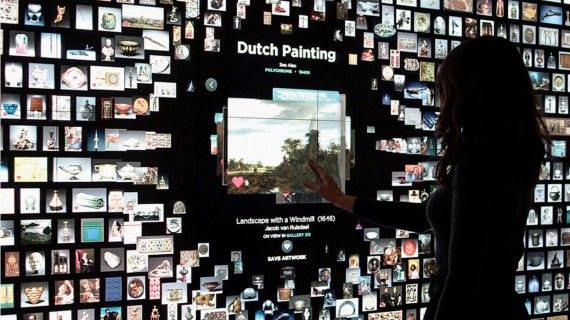
The Cleveland Museum of Art challenged Local Projects to transform the art museum experience, utilizing technology without diminishing the traditional gallery design. Given this, our studio created a suite of new interactives for Gallery One, including six “Lens” interactives that allow visitors to connect with art in new ways. One features a facial recognition experience that connects visitors’ facial expressions with masterworks from the collection, while another allows visitors to search the collection by drawing different shapes. The Collection Wall is a 40-foot wide multi-touch screen that features over 3,600 artworks in curated layouts, inviting visitors to explore and create their own tours. An iPad application, ArtLens, features these tours through wayfinding, image recognition, and curated content. The main concern was how to make the technology merge with the traditional gallery environment, keeping the main emphasis on the curated artwork and space, while still prompting visitor engagement with the interactives. It was a serious challenge to find the right balance between learning, contextual understanding and fun.
Context
With these interactives, we wanted to engage both those individuals who regularly visit art museums, as well as those who are new to the gallery experience. It was a primary goal for both of these groups to feel equally comfortable with the technology. For this reason, the interactives were designed to be opt-in experiences, which do not interrupt the traditional design of the galleries.
At Gallery One, visitors can explore digital versions of the artworks, gather ideas, and see the original context of the artworks. An expansive interactive wall allows multiple visitors to see all 3,600 artworks on display at the same time, inviting them to curate their own experiences by exploring connections between artworks. Custom tours can be connected to a new iPad application that allows visitors to both navigate the museum through curated tours and take tours made by other visitors. They are invited to absorb the art surrounding them, as well as make their own works of art; understanding creativity by being creative.
Impact
Dubbed by Fast Company as a “brilliant reinvention” that creates a “breakthrough museum experience,” Gallery One re-creates the museum as a platform for visitors’ own creativity. By creating joy, engagement, and wonder, the project opens new experiences for all who visit the Cleveland Museum of Art, allowing visitors to express their own interests through custom tours they create, or by using their own facial gestures to browse the museum’s collection. Gallery One changes how visitors understand the artworks and themselves.
Craft
We began the process with extensive working discussions about curatorial aims and concepts that infused the wide range of artwork installations planned for the space. It was important to carefully consider the learning goals the Education department had outlined for each of the disparate areas. Those aims became a part of our internal processes for evolving visual design and interaction. Because there were so many interactive elements being planned for installation in the space, it was crucial to consider all of them in a holistic manner and imbue each of them with consistent graphic design that was also in alignment with the branding and design of the physical space. It was also important to prototype the Collection Wall as quickly as possible, considering the hardware installation would be ready late in the project process and graphics selections on that large scale are crucial if one wants to avoid visual aesthetic missteps. At that point, we iterated upon the prototypes that evolved out of the interaction and graphic design phases. We refined features and tweaked functionalities after integrating the real content, in order to understand its place in the environment from a visitor’s perspective.

