Out of Box Experience - Accu-Chek Aviva
Team
Company | Institution
Category
Type
Project description
280 million people worldwide have diabetes causing 4 million deaths each year. With no cure on the horizon, daily self-management is the only option for sufferers to maintain a healthy lifestyle. Blood glucose levels must be tested several times a day and insulin dosage adjusted accordingly. While the technology to monitor blood glucose is improving, the cognitive and physical abilities of the (mostly older) patient group still present a major challenge. "For my patients who require insulin, the steps involved in the self-care of their diabetes can be complicated and overwhelming" -Diabetes Nurse (SanFrancisco) It often falls to nurses to overcome these usability obstacles - spending valuable consultation time training patients to use these devices instead of focusing on more important healthcare issues to prevent complications, e.g. blindness and amputations. In less developed healthcare systems, patients rarely get any training-leaving them frustrated by complex technology, procedures, and instructions that prevent them from effectively managing their diabetes, increasing their health risks. Roche Diabetes Care commissioned Frontend to analyze this issue. What are the usability barriers for patients and nurses? How could the process be simplified? How can we empower patients to manage their diabetes? How can we help nurses optimize training?
Context
We focused on one existing product Accu-Chek Aviva, designing a template for all other products in the Accu-Chek range. The challenge was to improve the overall user experience without modifying the product itself (due to regulatory constraints). Instead we focused on the discovery sequence, instructional materials and packaging structure. We employed user-centred design techniques to benchmark the meter against competitors, highlight problems and later to assess proposed designs.
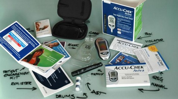
Research was conducted in 16 cities across the USA, Germany and UK with hospital and pharmacy visits, interviews and user tests with 79 Specialist Nurses and 70 representative patients. Testing identified several key problems. Nurses and patients require set-up instructions but 38% of nurses could not find the quick start guide amongst the 13 leaflets in the box. Many patients could not follow the instructions. Patients did not notice the calibration code key. Patients could not locate the Lot number and expiry date information on the test strip container which is needed for 50% of customer support calls – adding time and cost to the operation of the call centre.
Impact
In a market worth USD10.8 billion annually, even a modest growth in market share can provide substantial reward. Our solution radically improved the user experience of the Accu-Chek Aviva meter reducing the time required to set-up and train by 50%; the fastest of those tested. The impact was most profound for nurses – freeing up time for diabetes education and reducing the need for repeat training – nurses are the dominant driver for product recommendations. The time saving was achieved by implementing a controlled discovery sequence, clearer instructions and more intelligent packaging – reducing cognitive load and minimizing errors.
The Accu-Chek call-centre is the first line of support for users. In 50% of calls patients must provide a lot number and expiry date of the test-strips. In testing the redesigned container label made this task 27% faster – saving call time and a projected USD1.5 million in operational costs over 3 years. Despite the addition of a larger QSG and a new documentation management folder, the redesigned kit contains 20% less paper and a lower shipping weight. The real benefit is for patients however, with a positive initial experience granting them greater confidence in their ability to self-manage their diabetes.
Craft
“If you want to understand someone … walk a mile in their shoes” – To Kill a Mockingbird
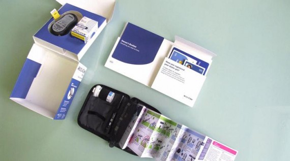
For us it started with being ‘diagnosed’ in the Mater Hospital, Dublin and going through the training process like all diabetic patients do; providing first-hand insight of training and helping us understand the patients’ cognitive and emotional needs. We focused on making the complex simple. The packaging was redesigned to control the discovery sequence, and revised instructions reduced the number of steps to prepare a test. The original kit contained 17 separate components and no clear start point- the new design presents just 3 items; a meter, a case, and a documentation folder. Yellow tabs highlight the ‘touch-me’ points.
The quick-start guide is attached inside the carry case, available precisely when the patient needs it. The revised guide and illustrations are the result of an intensive information design and testing process – resulting in fewer errors and improved user compliance. The instructions were further developed into a series of virtual training videos for patients who do not have access to a nurse, particularly poorer people with no health insurance. Available online, these ensure a positive user experience for the widest possible audience.

