RCS 5 Boomer
Team
Company | Institution
Category
Type
Project description
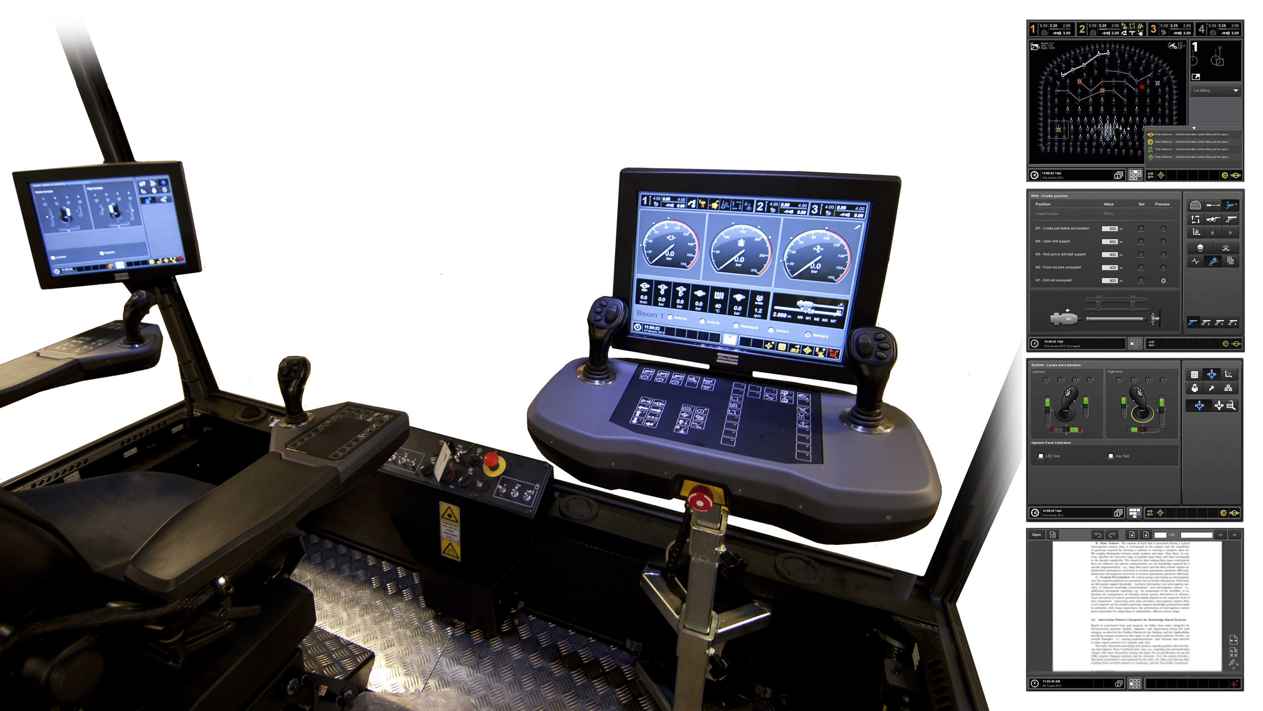
Earlier Rig Control Systems were engineered to perfection and capable of displaying complex controls and information. But it was too complex to use and required a lot of training to educate an operator. To motivate, and encourage old and new operators to work with these complex machines and avoid losing well-trained operators and billions of dollars, we designed a new rig control system for one of our most complicated rigs — Boomer.
Boomer, a Tunnel boring machine that can be best described as a mixture between a tractor and Si-Fi robotic Octopus. A machine equipped with cutting edge technologies that help them to drill underground and withstand the harsh and dangerous conditions of the mine.
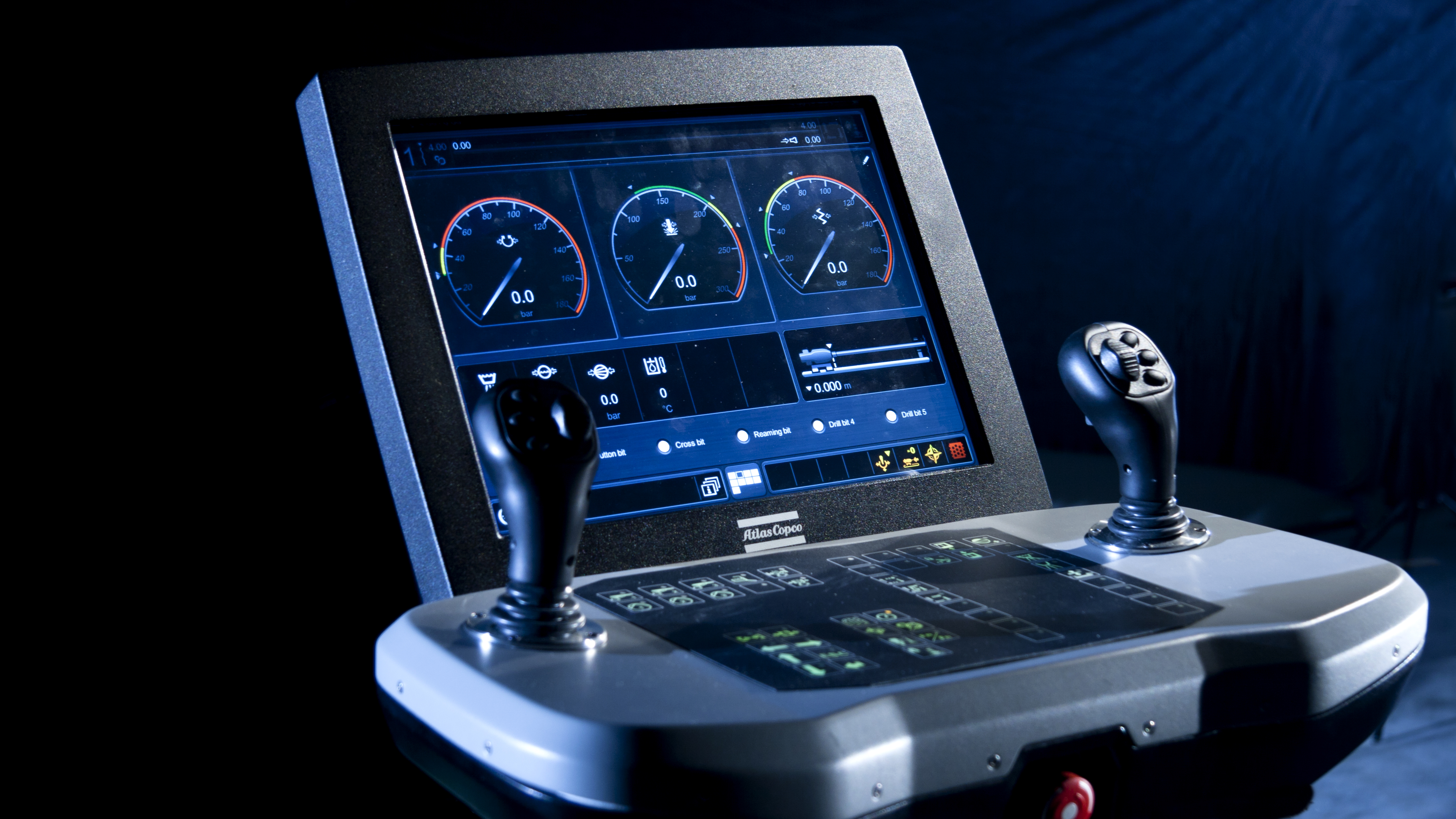
RCS is the primary user interface between the rig and the operator. It assists the user monitoring and controlling the rig, enabling local or remote control and logging statuses, events and error information for future analysis.
The team set out to design an operator interface which is ergonomic, intuitive and easy-to-use, enabling a faster production start when a new rig comes into site and reducing the training time needed for new operators.
Context
The new interface had to be designed to accommodate different types of users such as less educated, less experienced, ambidextrous and color blind. The new system also has to fulfill all industry and usability standards, which apply.
More than the visual experience, we carefully analyzed how the system is being used, who uses it (big miners with thick oily gloves) and where it will be used (dark mining tunnels, low light conditions) and what can be simplified to support operator in all different stages of the work process (number of steps required to complete an operation).
Initial rearrangement and organizing information in a logical and consistent manner has increased functionality, and also the normal workflows are organized based on a natural way of working which led to large functional gains.
All of these efforts give the operator a greater control over the machine and faster way of working. The new Information architecture will only display the information that is needed and avoid the information overload on the display, other information are hidden but easily accessible when needed.
Impact
Our design process resulted in variety of solutions for existing problems and suggested many improvements on the current system ranging from completely new Information Architecture, system design, much better and simpler navigation through the whole system, logical workflow and finally enhanced functionality by with the help of onscreen manuals thanks to a clear and readable graphical user interface.
The new design provides visuals cues and rewards by presenting the only the absolute needed information in the right time and there by helps operators to develop, improve, and instill habits by increasing muscle memory and reduced cognitive load.
In order to maintain our position as one of the leading companies, it was a necessity to update and modernize the control systems and most importantly, the user interface. As far as an operator is concerned her work happens in the Rig Control System. So it’s a very critical area for her to experience the brand. If the control system is perceived as outdated and inefficient, it will have a very negative impact on our brand.
The design communicates the brand’s high quality and focus on functionality. Our focus on interaction design puts Atlas Copco at a whole different level than our competitors.
Craft
The design process has involved series of carefully designed interviews, field studies, user studies, in mining and tunneling projects, focus groups were invited to evaluate prototypes both in test centers (called customer clinics) and in the field.
The design process was done in close collaboration with other departments such as Automation, Marketing and Service. Throughout this phase different tools were used, Sketching, Paper prototypes, Flowcharts, digital mockups using Balsamiq and HTML5 with detailed illustrations of main interface concepts to the smallest elements on the screen such as buttons to panels and other information bearing elements. The design was validated against ISO and other industrial standards.
As an example, one of the issues that the design team had to take into consideration during the design phase was the low light conditions of driving in tunnels. it is exactly like constantly driving at night and the operator’s vision shouldn’t be affected as she constantly monitor the screen. This resulted in to designing a visual palette that would work effectively in both dark and lighted work environments. By using self-explanatory and memorable symbols, the solution is made to work with global audience.

