The Waste Land
Team
Company | Institution
Category
Type
Project description
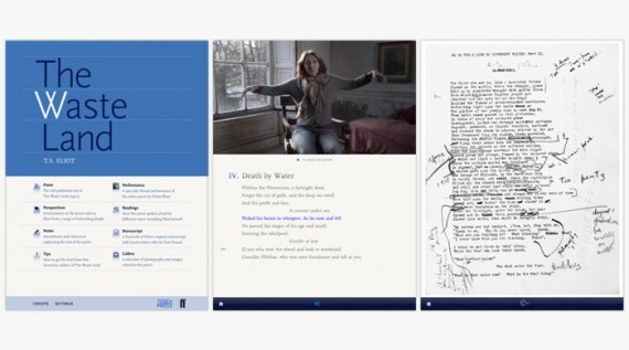
The Waste Land for iPad is the result of a year long collaboration between the poem’s publisher Faber and Faber, and Touch Press a digital publisher specialising in highly interactive books. Our aim was to bring the poem to a new audience and to use the special capabilities of the iPad to give that audience the tools to appreciate perhaps one of the greatest works of 20th Century literature. To that end we offer synchronised readings and performances of the poem by, among others, T S Eliot himself, Sir Alec Guinness and Fiona Shaw. We also provide 35 expert perspectives on the poem in the form of filmed interviews with Seamus Heaney, Jeanette Winterson and others. Extensive and detailed notes can be accessed to explain the many references and historic allusions. And Eliot’s original manuscript can be displayed, including Ezra Pound’s extensive edits and deletions, to show how the poem took shape. But at the core of the iPad edition is the poem itself, beautifully typeset and, with a quick turn of the device, uncluttered and carefully presented without embellishment.
Context
The iPad is a distinctive ebook platform capable of delivering a rich interactive multimedia experience. For a renowned publisher such as Faber & Faber, it presented an ideal opportunity to republish some of its classic texts in digital form for new audiences. For Touch Press, the partnership with Faber to create The Waste Land app was an opportunity to showcase how carefully crafted interactivity and rich media could revolutionise the reading and understanding of literature. The Waste Land is the first iPad app to explore every facet of a poem – from its inception to its interpretation.
The biggest challenge for the team was how to present the primary text on a digital screen and maintain the authenticity of an intimate reading experience. The central vision of keeping the poem in its purest form always at the heart of the interactive reading experience was the key drive for creating a spare and unobtrusive, yet deeply functional, user interface. The appropriateness of the solution is best captured by the New York Times review, ‘For all its accouterments, The Waste Land app honors the silence of the text itself, the silence that makes Eliot’s many voices in this poem so clearly audible.’
Impact
The Waste Land for iPad has now been downloaded by 20,000 people and has received more than 100 highly positive published reviews, posts and articles. These include an editorial in the New York Times and an extended cover feature in the Culture section of the London Sunday Times. The production team has been interviewed on many occasions by international media including the BBC, public radio in the US and even a station in Brazil. Feedback from our audience has been overwhelmingly positive, with many people saying that for the first time they have been enabled to enjoy and appreciate Eliot’s difficult but brilliant work. This title has been recognised as a milestone in digital publishing, showing that it is possible to publish mature, considered, literary works in the new medium. We have been invited to present at conferences including FutureBook, Tools of Change and TED.
Craft
The typographic design and presentation of the poem and user interface was a key success factor in creating an appropriate reading experience on the interactive screen. Scala, the typeface family used throughout (designed by Martin Majoor in 1990) was chosen because it is a modern classic, that looks and feels good to read. It has good legibility on screen because of its straight serifs and low contrast, and encompasses both sans and serif typefaces with a range of weights that enable texture and contrast in the typography. The colour palette of the user interface was also carefully considered. The poem text is not presented on white but on a warm tone of light grey, and the text and background are not so contrasting as to tire the reader.
Equally, the interface elements and overlays are muted and spare so as not to interfere with the already demanding nature of Eliot’s text. The high production values and careful editing of both the audio readings and video performance are evident. However it is the clever, and sometimes hidden, interaction control that the reader has over them that merges them seamlessly into the reading experience. Strong and deliberate attention to detail permeates the design at every level—visual layout, interactivity, typography, content accuracy—and is also reflected in the underlying software technology. The net effect of this is to minimise distraction from the reading experience.

