The Redesigned NYC.gov
Team
Company | Institution
Category
Type
Project description
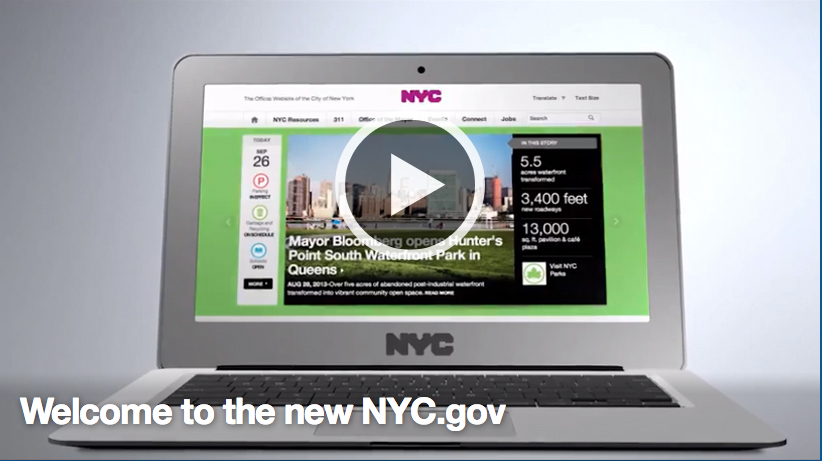
New York City’s municipal website, NYC.gov, serves more than 35 million unique visitors per year and gets over 250 million page views annually. It’s the primary resource for New Yorkers to accomplish tasks such as paying parking tickets or determining the right school for their child, and for the city to share its initiatives and accomplishments with its citizens. It had not been redesigned since 2003 and, over time had become a disorganized hodgepodge of text and links. It had become difficult for users to find what they needed, and they were increasingly calling 311 (the city’s public help line). The city had already started to invest in a new technology infrastructure and make city data more open and accessible – this was the final effort to bring more power, information, and transparency to the people of New York. Our goal was to create a more intuitive, usable, and efficient experience that would be easy to search and browse, and a delight to use. The experience had to beat accessibility standards and work in many different languages. At a higher level, our goal was for NYC.gov to set the standard for the way governments communicate with and empower their people.
Context
The audience in this case was very broad. There are 8 million citizens in New York City and millions of commuters, business owners, etc, who interact with the city regularly. Within that audience, there are different levels of digital experience and a wide array of digital devices. We learned, for example, that many families in NYC own one smartphone and that serves as the family computer at home. On the other end of the spectrum, there is a growing tech community who regularly access the website from an array of devices – whatever they have handy at the time. When we began the redesign, mobile traffic was at 25% and growing. We also learned that the ways and reasons people use the site are vast. Some visit regularly to file for a disability check while others visit once a year when they have a very specific question.
Impact
The new NYC.gov launched in September 2013. In every comparative user study we performed, it was easier for people to accomplish their tasks and to find information they needed in the new experience. While it’s too soon to share any hard data, the day after the site launched, it was hailed by many as “setting the standard for government websites.”
Craft
We started by conducting user research with New Yorkers, analyzing the content and behavior analytics on the existing NYC.gov, reviewing other government websites, and speaking to city stakeholders. From this we arrived at a vision: First, we aimed to create a resource for New Yorkers enabling them to quickly complete simple tasks and get questions answered. Second, we wanted to provide a way for the mayor and city to share initiatives in more compelling ways.
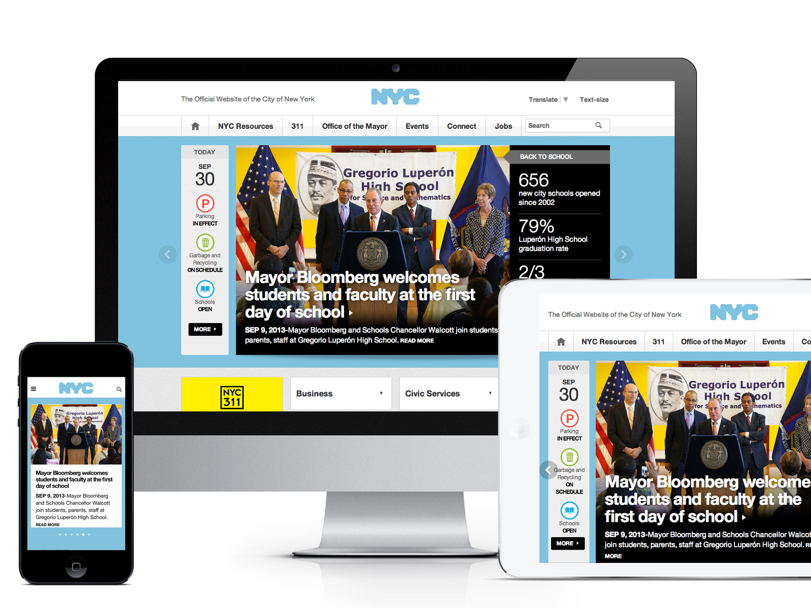
We used an iterative design process, working on content strategy while also exploring design concepts to nail down the main interactions and design. The old website was very flat and categories as broad as “business” were on the same level as “anti-graffiti initiative”, so we created 8 meaningful content buckets to drive the entire content experience. During concepting, we prioritized the information and tasks that New Yorkers need most, putting those front and center. Graphically, we created a design that felt friendly and approachable, but also solid and dependable. To ensure the fastest possible load time and performance, we avoided extra graphic frills and kept the design simple. Finally, we created a responsive experience to enable people to access the site easily from any device.

