New Nordic by SAS
Team
Company | Institution
Category
Type
Project description
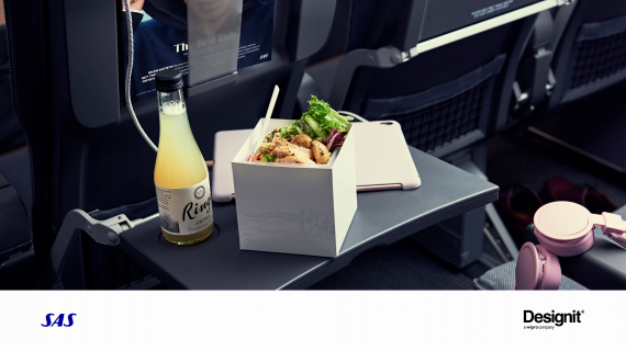
Airline meals have remained largely unchanged for decades. A 10cm cube is about to rewrite the rulebook – and give new meaning to the phrase “a square meal.” No longer will passengers be stuck behind the pull-down tray, unable to use their laptop, or get up to stretch their legs – and no longer will they be faced with a meal that feels uninspired. The Cube is at the center of SAS’ new onboard dining experience for short- and medium-haul flights – and it delivers what customers want, in a modern and practical way.
“It’s not possible to reproduce a restaurant experience onboard, so we’ve created something completely new, that takes in everything the customer wants, and delivered it. We think the Cube is going to revolutionize the onboard dining experience,” says Gustaf Öholm, Head of Onboard Products & Services.
The inspiration for the exterior of the Cube comes from Scandinavian scenery. Its 10cm exterior is a cool white, conveying a feeling of calm, while soothing graphic illustrations reflect the Norwegian mountains, the Danish coast and Swedish forests. When you open it, the theme continues to unfold, with Scandinavian nature also reflected on the menu graphic.
“We worked with a Designit to develop a premium experience with the Cube, using the graphics to give a dynamic feeling of our Scandinavian heritage,” says Kristine Mayer, Senior Manager Product Design & Communication at SAS. “Opening up the Cube is part of the experience – a bit like unveiling a brand new mobile phone, or a box of premium chocolates. Everything is in self-contained layers – the menu card is on top, then the cutlery is revealed and then your condiments.”
Beneath the condiment layer is the main meal, which features natural local ingredients. A warm side dish will be offered separately, as well as a small box of premium handcrafted chocolates.
“Food waste is a big issue, both on flights and in the world at large,” says Öholm. “We know that many passengers don’t want a three-course meal when flying, so we’ve taken these extra elements out of the box itself, allowing passengers to decide for themselves what part of the meal they want. Depending on the time of day, we’ll be offering extras out of the Cube such as warm side dishes. This reduces waste, something SAS is committed to.”
Everything from the cutlery to the cups has been rethought, with top quality design central to the self-contained premium package. For breakfast, there is the Cube box, a simpler version of the main Cube, but still reflecting Scandinavian landscapes and heritage.
And when you’re finished with your meal, you can simply put everything back into the compact Cube and tuck it to the side. Then it’s back to your laptop or book or an opportunity to get up and stretch your legs.
The passenger is now in control.

