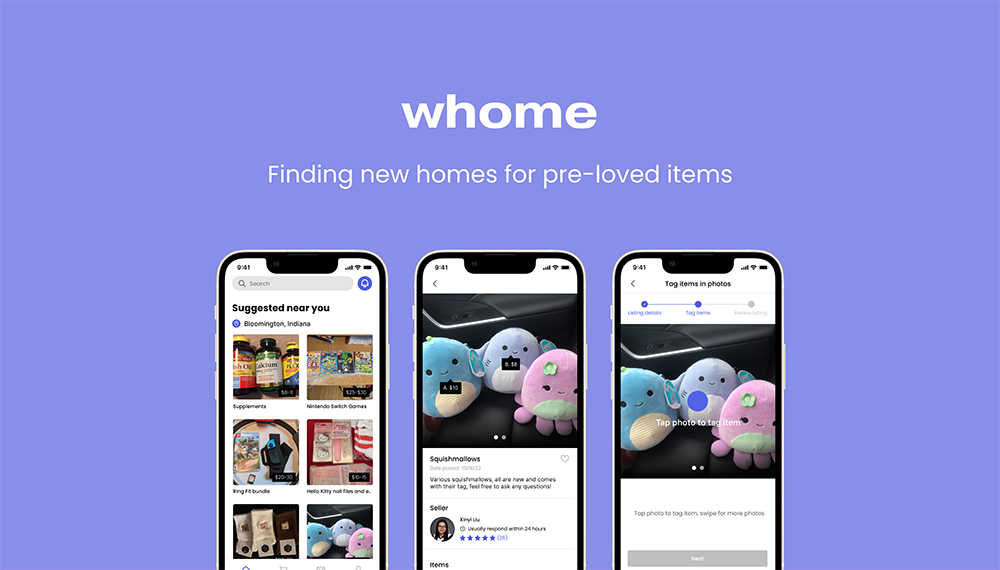
Whome: Finding new homes for pre-loved items
Team
Company | Institution
Category
Type
Project description
Throughout our lives, we amass a myriad of personal belongings, from the teddy bear we received at birth, to the new shoes we bought last week. As our belongings accumulate, it is inevitable for some items to stop serving us, whether it be a shirt that’s no longer our style, or an old toy we no longer play with. However, just because an item no longer serves us does not mean it cannot serve someone else. Whome helps pre-loved items find a home where they can be appreciated and cherished once again.
Whome strives to optimize the rehoming process with its flagship feature, the ability to tag individual items in photos. This feature was born from the shortcomings we discovered during our research on existing marketplace platforms. We realized that many listings contained photos of multiple items, rather than one item per listing. While it is easy for sellers to just take one photo, it is not clear to buyers whether or not a specific item amongst the bunch is available or not.
Whome’s photo tagging feature gives the best of both worlds; sellers can take one photo of their items to save time, and buyers can see the details and availability of individual items clearly. Our hope is that by optimizing the process of selling secondhand items, more people will choose the more sustainable route of reselling and not simply throwing away items that still have a lot of life left in them.
We believe our project deserves an Interaction Award because we applied a common user interaction – tagging in photos (think Instagram, Facebook, etc.) – in a new context to solve a problem that is common across multiple online marketplace platforms: sellers posting one photo containing multiple items in their listing. The main way that sellers specified the price, name, and availability of each item was by writing in the listing description. This is not an efficient system and leaves a lot of room for mistakes and misinterpretation. For example, sellers may not be updating the availability of items and buyers will waste time reaching out about an item that has already been sold, or buyers may misinterpret the name of an item for a different item.
The opportunity our solution aims to address is allowing sellers to continue the behavior that best serves them, while eliminating the problems that it creates for buyers. We understand that it is easiest for sellers to just take one photo of everything they want to sell, rather than taking individual photos. But we also understand this can create confusion for buyers. With our photo tagging feature, we were able to achieve the best of both worlds.
The impact of our project was revealed to us during usability testing. Users found it easy to distinguish between items in photos, and thought the listing creation process was straightforward. The most meaningful piece of feedback we got was that 80% of testers felt more inclined to sell items on Whome compared to other platforms because of how intuitive the experience was. This discovery was particularly important to us because we understood that realistically, the easiest way to deal with unwanted items is to simply throw them away, and many people don’t bother reselling their items because existing online marketplace platforms come with unattractive obstacles that deter people from putting in the extra effort to make the sustainable choice. So hearing that we were able to push the needle forward just a bit towards creating attractive alternatives to discarding usable items meant a lot to us.
We followed the Double Diamond design process for this project, as this is a reputable and trustworthy method that has been validated by IxDA and other design organizations. It was important for us to explore different design spaces before defining the problem, so we found the Double Diamond method especially fitting since one of the key steps is diverging before converging.
- Contextual inquiry: Aiming to understand user’s pain points and their current online marketplace experience
- Competitive analysis: Analyzing existing online marketplace platforms to identify shortcomings in usability and user experience
- Affinity diagram: Synthesizing findings from the previous steps
- Problem frame: How might we improve the clarity of product listings for buyers while not burdening sellers with many extra steps?
- Brainstorming: Developing ideas and concepts
- Sketching: Sketching out wireframes of chosen concept
- Prototyping: Building a high-fidelity prototype
- Moderated user testing: Evaluating our project usability and seeing if we effectively addressed user pain points



.png)

