Windows Phone 7.5
Team
Company | Institution
Category
Type
Project description
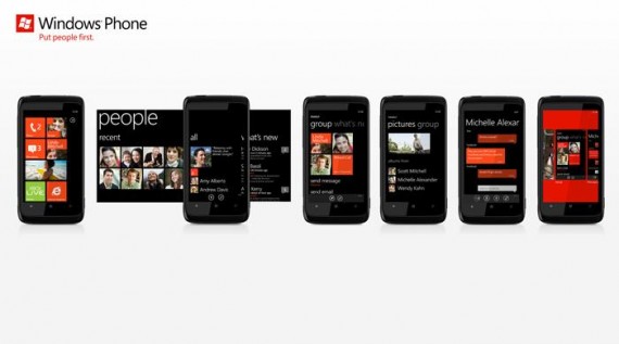
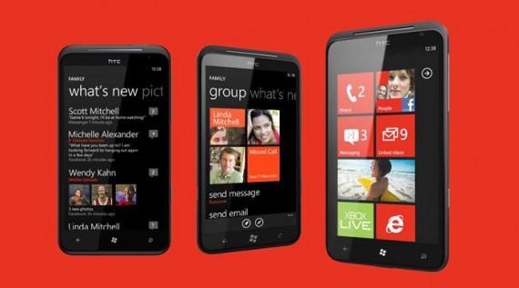
Windows Phone is the phone that puts people first, and makes it easier to stay close and connected to the people that matter to you. A person or group that you care about can be pinned right to the Start screen, and with Live Tiles, you can see a friend’s latest status update at a glance. Social networks like Facebook, Twitter, and LinkedIn are built right in to the phone, so even a simple contact card comes alive with news about what your friends are doing, where they’ve checked in, and the photos they’ve posted. Staying in touch is easier, with SMS, Windows Messenger, and Facebook IM all in one unified messaging experience. When your friends comment on your Tweets or status updates, instead of chasing them down in different apps – now they come right to you, all in one place. Groups let you organize your social circles, so you can see what’s new with just a few people at a time, or start a new message to an entire group with a tap of a button. In a market obsessed with apps, Windows Phone is focused on making it easier to stay close and connected to people.
Context
Windows Phone 7.5 builds on Windows Phone 7, the phone that rebooted Microsoft’s approach to mobile. The challenge was to quickly fill in the experience gaps from our first release, while strongly building out the unique aspects of our experience (People First, integrated Social Networking), without losing the high quality of “Metro” UI. In a market that is strongly focused on technology and apps, we chose to put design, people, and communications back at the center of the mobile experience.
Impact
In day-to-day use of a Windows Phone, communication with People is an integrated part of the experience. Feedback from users is that using Windows Phone makes them feel more connected to people compared to phones that are focused on App launchers. The Windows Phone Design Team’s focus on “People First” is not just visible in the core experiences of the Windows Phone product; it’s also the message in our Marketing. At the center of Windows Phone’s external communication to customers is the message of “Put People First”. In terms of profitability, it’s the Design of Windows Phone that has really captured the attention of the press and customers, generating large amounts of positive coverage and discussion about the product and the quality of the experience. Windows Phone is showing customers and the industry that Microsoft does care about design, experience, and making great products.
Craft
First: People First. From the very beginning, our designers think about how to put people at the center of the experience. And, our User Research team is embedded in our studio, as is our User Research Lab. Testing and retesting every design is a daily part of our process.
Second: Metro, our design language. The Metro design system uses color, typography, and the users own personal content to shape the experience. Careful attention is placed on getting the right information hierarchy, weight, and balance on every screen. To get every pixel just right, new Design to Engineering processes and teams were pioneered in the Windows Phone group.
Third: A principle we call “Fierce Reduction”. It’s a design approach that pushes our team – both Design and Engineering – reduce a solution down to the simplest experience possible. Reduction of visuals, reduction of features, reduction of interactions, reduction of code, all to achieve the most efficient experience that we can. The goal is to craft a product that is easy, elegant, fast, and powerful – because our team has made the tough decisions that get rid of clutter and bloat.

