FreshBooks for iPhone
Team
Company | Institution
Category
Type
Project description
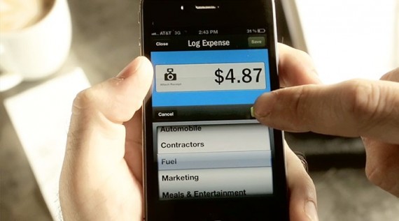
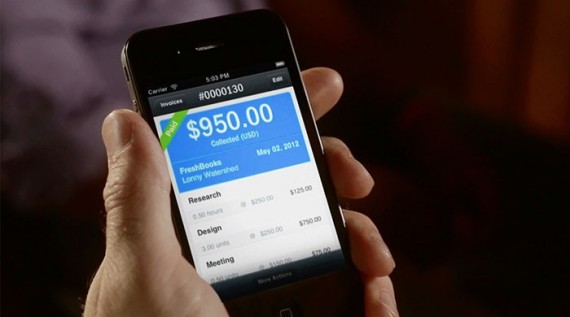
FreshBooks for iPhone is FreshBooks' first mobile app built to complement our leading cloud accounting web application. Our goal was to create a quick and easy mobile version of our web application to help our customers save time billing their clients so they can spend more time with their small businesses. This meant not only optimizing the web app experience for a smaller screen, but also challenging ourselves to consider the real human contexts a mobile accounting application might be used in. The result is a product that people love and that is already helping thousands of customers save time.
Context
FreshBooks has been around almost ten years during which time we have focused entirely on building and maintaining a world class, extremely easy-to-use web application. Making the painful world of small business accounting seem easy or even fun is a huge part of what we do and a big part of our approach to design.
FreshBooks for iPhone was our first new product since inception and the first time we considered a context outside of a typical desk based scenario. We are very lucky to have passionate and vocal customers, and they had been asking us for an iPhone app for some time. There were already several 3rd party apps in existence, but we felt that as a cloud service it was important for us to maintain a consistent experience for our customers across all platforms and contexts.
Impact
“The FreshBooks iPhone app was very well received, gleaning 100s of universally positive reviews and maintaining a consistent five star rating in the Apple App Store.
“The apps works great and exactly as it should. Very easy to use just like their website. 5 stars all the way!”
“Pretty, smart, clean and fast. Nothing short of excellence from these guys. There is visible attention to detail in how the app is laid out and presented, and there was clearly a lot of thought put in the user experience as it is a joy to use”
Avery Swartz @AverySwartz “My clients are amazed when I invoice them on the spot using @FreshBooks on my iPhone. LOVE Freshbooks!”
Clayton Dorris @cedorris “Dear @freshbooks, thank you for making an amazing product and killeriPhone app. You may my life easier.”
Craft
FreshBooks exists because it’s first user and co-founder, Mike McDerment, was frustrated one busy afternoon in 2003 when he accidentally saved over an invoice and lost his work – frustrating right? Every design project at FreshBooks starts with empathy for our customers (we’ve been their too); it is the fundamental principle that drives everything we do.
We started designing FreshBooks for iPhone by interviewing our customers about their needs and the way they were already conducting business from their mobile phone. We also audited nearly 10 years of feedback and feature requests we had previously collected from our users.
From these interviews and research we gleaned insights we used to build a set of design principles that guided the entire design process. These principles were married with our established visual guidelines to produce a working prototype of the app.
We tested this prototype with real users in their real work environments and iterated our design based on their feedback and our observations of their work life.
We believe the result is an iPhone app that suits the lives of our customers perfectly.

