Mia Journeys App
Team
Company | Institution
Category
Type
Project description
Art museums have long served as epicenters of cultural heritage, human experience, and social gathering. In recent decades, however, new competition for our time and attention has arisen in the form of arcades, malls, and home theaters, not to mention a never-ending stream of digital diversions. Celebrating its 100th year, The Minneapolis Institute of Art rebranded itself as Mia seeking to reengage the public with its world-class permanent collection and world-traveling special exhibits.
Art museums have long served as epicenters of cultural heritage, human experience and social gathering. In recent decades however, new competition for our time and attention has arisen in the form of arcades, malls and home theaters, not to mention a never ending stream of digital diversions. Celebrating it’s 100th year, The Minneapolis Institute of Art rebranded itself as Mia seeking to reengage the public with its world-class permanent collection and world-traveling special exhibits.
In response, we conceived of a way to fight fire with fire. We designed a way to participate in the museum by taping into the public’s affinity for digital experiences, the effectiveness of storytelling and the omnipresence of smart phones. Informed by the five need states of museum visitors (as identified by John H. Falk) The Mia Journeys app does not simply provide miniature versions of all the art as if that could replace a visit to the museum. Instead we provide the inspiration and mechanism for a new way to adventure through an amazing museum campus that covers nearly eight acres and includes art from around the world and across time.
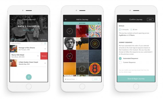
Journeys can be created, shared and followed. Each member can create a theme that connects any number of works together in a way that is personally interesting. The app helps identify the works and maps them throughout the museum, then estimates the time required to see them all. The ability to curate a trip through the collection becomes a journey of discovery leading to art that might never before have captured attention but which suddenly feels subtlety or obviously relevant by virtue of the theme. Anything can be a theme: artist, time period, location, genre, medium, love, scandal, rivers, the ocean, hats, cats…you name it.
Creating a journey may not be for everyone, so the app facilitates sharing. Members can browse through the collection of journeys looking for something that calls to them. In addition to member created journeys there are journeys created by the Mia curators and a few local celebrities like singer Dessa and Minneapolis Mayor Betsy Hodges.
Regardless of whether creating or following, the beautiful interface design takes full advantage of gesture based design principles including swipe, scroll, press-and-hold and drag-and-drop movements to allow the interface to remain as uncluttered and fluid as possible. The result is a design that is rigorously structured as it operates on methodical patterns yet feels highly flexible to the touch. It’s a joy to use which facilitates our goal to get users to look up from their phones to become engrossed in the art and the grand space that houses it all.
Is it slight of hand to employ the very tool that most distracts us from real-world experiences as the very device that lures the public back inside one of our greatest institutions? Why yes, and we take pride in every moment a user puts the phone back in a pocket to simply marvel at the art that has been freely available all along.

