Swegon IQ-Navigator - A Handheld Control Unit
Team
Company | Institution
Category
Type
Project description
The main purpose for indoor climate systems is to create healthy environments with clean air and agreeable temperature for people’s well-being. Functionalities and features to improve air quality is evolving, and our increased environmental consciousness puts new demands on energy efficiency, as well as lowering cost and the overall environmental footprint.As one of the top innovative companies in the ventilation industry, Swegon faced a challenge with their new generation air handling units. Over the years, more and more features had been added making it increasingly complex and difficult to handle. It required professionals with extensive experience to navigate and handle the large number of settings needed to stage for a world-class indoor climate and also saving energy. Important functions were not being used, because many vital features were hidden and the users never understood how to use them or that they even existed. In 2010 Swegon engaged Veryday to help them transform an overloaded control system into a user-friendly control unit. Besides turning complex into simple they wanted this new control unit to play a key role in the overall brand experience.
Context
Swegon’s air handling units are sold on a global market and used in spaces like hospitals, offices, and schools. We applied our deep research methods in extensive user studies to uncover the different needs and goals from a large variety of users. Most users could not articulate their problems, but during the research we uncovered severe problems, especially connected to the complexity and the lack of overview. We also met a few users that was proud to be one of few that actually could master such a complicated product, it was a sign of expertise. They would be the most difficult users to convince with a new solution.
Besides technicians and service staff we also met with and uncovered important secondary users, among them Swegons own staff in the assembly line, receptionists, and the inexperienced janitor that sometimes have to cater for the maintenance.
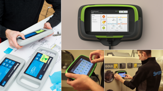
The solution was designed in close collaboration with stakeholders from Swegon and different groups of users. We used a series of low-level mock-ups and high-level interactive prototypes to evaluate and capture ideas in an iterative process. Our deep user and stakeholder involvement was really the key to success.
Impact
Our development has led to a handheld remote control unseen in this industry. Evaluations show that we have managed to exceed the users and our client’s expectations. The new user interface has been proved to be much more intuitive and easy to use. It allows the users to approach and experience the system differently depending on their role, with selected information and guides supporting their specific needs, making them both perform and feel efficient and professional. The interface ensures that Swegons indoor climate systems are set up to fully utilize the built in innovative functions, allowing any building to have a world class healthy indoor climate at a minimum environmental impact. With the right set-up the system can use less than 25% of the energy otherwise used.
The market has shown a large interest and we’re together with Swegon confident it will help them stay in the forefront of their business, not only with innovative technology but also by setting a new standard in usability.
Craft
Intense workshops helped us uncover Swegon’s internal knowledge, while also introducing our process and expected outcome. During extensive user research we uncovered real needs, goals and scenarios.
After synthesizing the insights we simplified the information architecture to better meet our scenarios. A new interaction design framework was early sketched out and iterated with interactive Lo-Fi prototypes. Our goal was to design a system anyone would feel confident to approach and use, expert or not. All users now log in to a role, with it’s unique content.
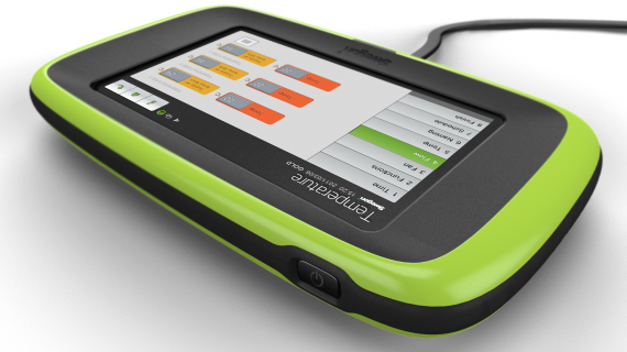
Interactive guides ensures necessary settings are made at setup and maintenance. Category grouping of functions allows easy adjustments of individual and related settings. A dashboard presents a quick system overview with flowcharts, current setup and status. Guides, dashboard and settings constitutes the top-level screens, and it’s easy to swipe from one to the other to start off from where it’s relevant. The data is enhanced graphically to be better communicated and easier to understand.
The grip-friendly tablet, purposely designed to stick out, was tested using several mock-ups. It was designed in parallel with the GUI to be mobile, durable and easy to hold in one hand while interacting with the large touchscreen.

