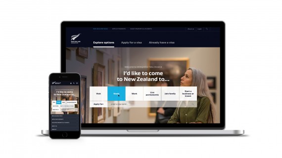
Immigration New Zealand Visa Gateway
Team
Company | Institution
Category
Type
Project description
We are entering this project into the Engaging category as this website will play a major role in improving how migrants engage with Immigration New Zealand throughout their Immigration journey.
We are entering this project into the Engaging category as this website will play a major role in improving how migrants engage with Immigration New Zealand throughout their Immigration journey.
CONTEXT Immigration.govt.nz is one of the most visited websites in New Zealand with over 32,000 unique visits each day and over 12 million in the past year. At the beginning of the project Immigration New Zealand had 4 separate websites covering different aspects of the immigration journey from attraction, applying & gaining a visa, through to preparing to move and settling in New Zealand. The main website containing all of the visa information was extremely dense, difficult to navigate and poorly written.
CHALLENGE: The New Zealand visa system is extremely complex with hundreds of variations available. We undertook user research, which showed that many customers felt like they never reached a point where they were certain they had found the right visa. Some had been through multiple visas which were unnecessary in the Immigration journey, causing a lot of emotional strain and additional cost. These insights, together with many others lead to an approach focused on the development of a data model rather than template driven CMS pages, to help remove complexity from users and build a dynamic experience based around motivations where users would be able to explore, compare and select the right visa for their situation. We had to consider how to simplify the journey, make it more explorative for customers and set clear expectations early. This was a carefully considered balance, in order to attract people that New Zealand needs, while gently helping others to understand that they might not qualify for their desired visa, but that can still look at other options.
THE SOLUTION: We had to completely rethink how design can enable people to discover information and move through levels of detail. The content was a critical part of the design and completely rewritten to create a fully integrated design experience which is simpler and clearer to understand.
PROCESS: 2.5 years working in a close collaborative relationship with Immigration. – Design research: • 51 interviews across migrant & industry segments • 17 profiles • 6 personas, customer journey maps & ideal service experience maps – Detailed interaction & visual design: • 28+ responsive page designs • 60+ components • Data model & business rules consultation – Content design & strategy – Usability testing with Migrants and Employers – Front-end development
OUTCOMES:
- Major shift within Immigration’s thinking towards migrants to be more holistic, empathetic & motivation lead
- Extremely smooth launch without the expected spike in call centre traffic with a new site
- Increase in digital applications over paper based visa applications, with day after day of record number conversions through to the application process
- Big drop in eligibility related calls to the call centre
- Improved call centre training process based on insights from research outputs.


