Practice Fusion iPad application
Team
Company | Institution
Category
Type
Project description
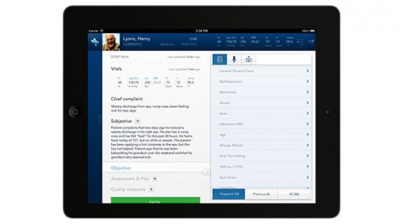
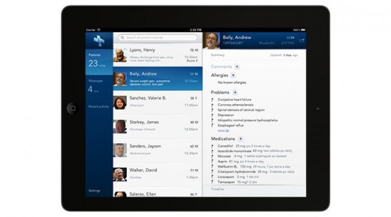
The Practice Fusion iPad app empowers doctors to review and chart patients medical history while meeting with patients. The application liberates the doctor from the desk-bound keyboard and mouse, letting them engage more with their patient than with their technology. Our design delivers an EHR experience that matches the thinking and workflow of doctors. With a patient's entire history at their fingertips, they can see the context for the visit, and easily capture details about their condition through touch or voice. The complexity of the underlying system has been pushed to the back, giving the doctor a simple schedule-driven interface to guide their day. The iPad leverages a doctor's existing data in Practice Fusion's EHR and gives her a lighter, less intrusive tool for working with it.
Context
Practice Fusion invested four years developing a robust, free, web-based EMR platform; this investment resulted in hundreds of thousands of doctors adopting it to run their primary care practices. With the advent of the iPad, Practice Fusion saw that doctors had a real opportunity to become much more mobile, freeing themselves from heavy data entry on a desktop computer. The challenge was to start from the complex desktop application and build an entirely new way to interact with the system via touch.
Based on observing doctors during our ethnographic research, we committed to allowing clinicians to document common problems without typing at all on the iPad. This deeply directed our design decisions and pushed us to smart reuse of data, proactive anticipation of user needs, and smooth workflows.
The iPad has a relatively small screen and patients can have exceptionally long medical records. Compounding this, doctors often need to compare a patient’s present state against a past state, or read something from one part of the chart and record it into another part. We were very conscious to not force doctors to hold all of this in their heads, and to support parallel work streams at any moment.
Impact
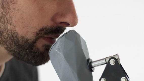
Our design enables clinicians to rely on the application to support their patient visits rather than constrain them. Clinicians can continue to leverage their investment in the Practice Fusion infrastructure, yet adopt the very latest technologies to run their practice. This truly shifts the paradigm of the medical office visit, allowing the physician to interview the patient while charting, not leaving details to memory or later transcription. By using smart templates for common conditions doctors can document the entire visit without ever using the keyboard. The application also supports voice recording, which allows the patient to hear the doctor’s interpretation and analysis of the problem, making the office visit much more conversational.. We expect the application to increase adoption for clinicians who have been reluctant to bring a desktop computer into the exam room.
Craft
We started our project with a few weeks of first-hand ethnographic research: interviews and observation, both of people who use the current system and those who were reluctant to move to an electronic system.
Our design process included a week of exploration, starting with a one-day workshop of generative exploration for ways to solve many of the problems unearthed during research: how to organize the user experience, how to handle foreseeable technical failures, how to facilitate clinician hand-offs, and how to chart in a touch environment.
We synthesized a few of the approaches to create a complex, nuanced interaction. The final design supports three different interaction streams. The primary stream allows clinicians to move from a time-based appointment list to individual patients and their office visit details. Alternate streams provide time-based task lists to support office workflow and history browsing to support interruption-driven work.
To verify that the final interaction felt natural and intuitive, we constructed a prototype, which gave us confidence in the simplicity of our approach. From our prototype, we found that we didn’t need an explicit affordance to help the user understand the navigation structure: the wayfinding between states was natural and intuitive.

