Re-imagining Atomic Force Microscopy
Team
Company | Institution
Category
Type
Project description
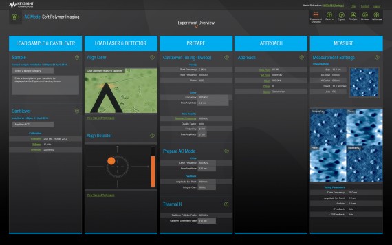
My colleague, Kent Eisenhuth, and I were asked by Keysight Technologies, the world’s leading electronic measurement company, to redesign the software that controlled their line of Atomic Force Microscopes.
My colleague, Kent Eisenhuth, and I were asked by Keysight Technologies, the world’s leading electronic measurement company, to redesign the software that controlled their line of Atomic Force Microscopes.
Originally created for the scientific community, the application had a very steep learning curve that required years to master. Part of the problem was that the application presented all of the microscopes functionality, to all users, all of the time. In addition, the application was designed around the standard, multi-window, Microsoft desktop design language, meaning that completing a single task meant having a LOT of open windows.
As a result, zero percent of new users were able to successfully use the application, experienced users required years of training and powerful functionality remained hidden in plain sight.
Keysight needed to decrease training time, allow experienced users to focus on scientific research rather than learning a new interface, and open up the technology for use outside the traditional academic areas of physics and chemistry.
After an intense period of research to understand the workflows and mental models of academic users, support technicians and new, non-traditional corporate users, the redesigned application provided a solution that eliminated novice user training while simultaneously incorporating new functionality and a unique design aesthetic.

