Terrarium - living maps
Team
Company | Institution
Category
Type
Project description
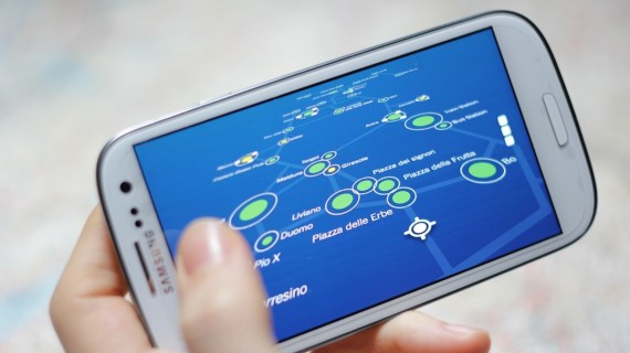
When we try to translate our own experiential geography on a flat surface we often get puzzled. Maps, even online and mobile ones, seem to us hostile, deliberately complex, sometimes cryptic. The reason is that we cannot communicate with them. They always look the same. They know everything, but they do not learn. They are fixed and identical for everyone. And as long as they get more complex, with layers upon layers of information constantly added to them, they become more and more confusing. Terrarium is the solution to the maps’ ineptitude in making themselves understandable, enabling us to communicate with them. It allows the creation of personalized paths, giving directions for the easier route based on the user’s knowledge, which is not possible with other navigation systems, and integrates suggestions in the path-generation process. It adds sharing possibilities, which unlike existing services allow real-time collaboration on creating maps and location databases, and sharing not only places but also paths, itineraries and whole maps. It finally joins together in a single mobile application all this functions, using a graphic interface that remains simple and intuitive in spite of the complexity of the system.
Context
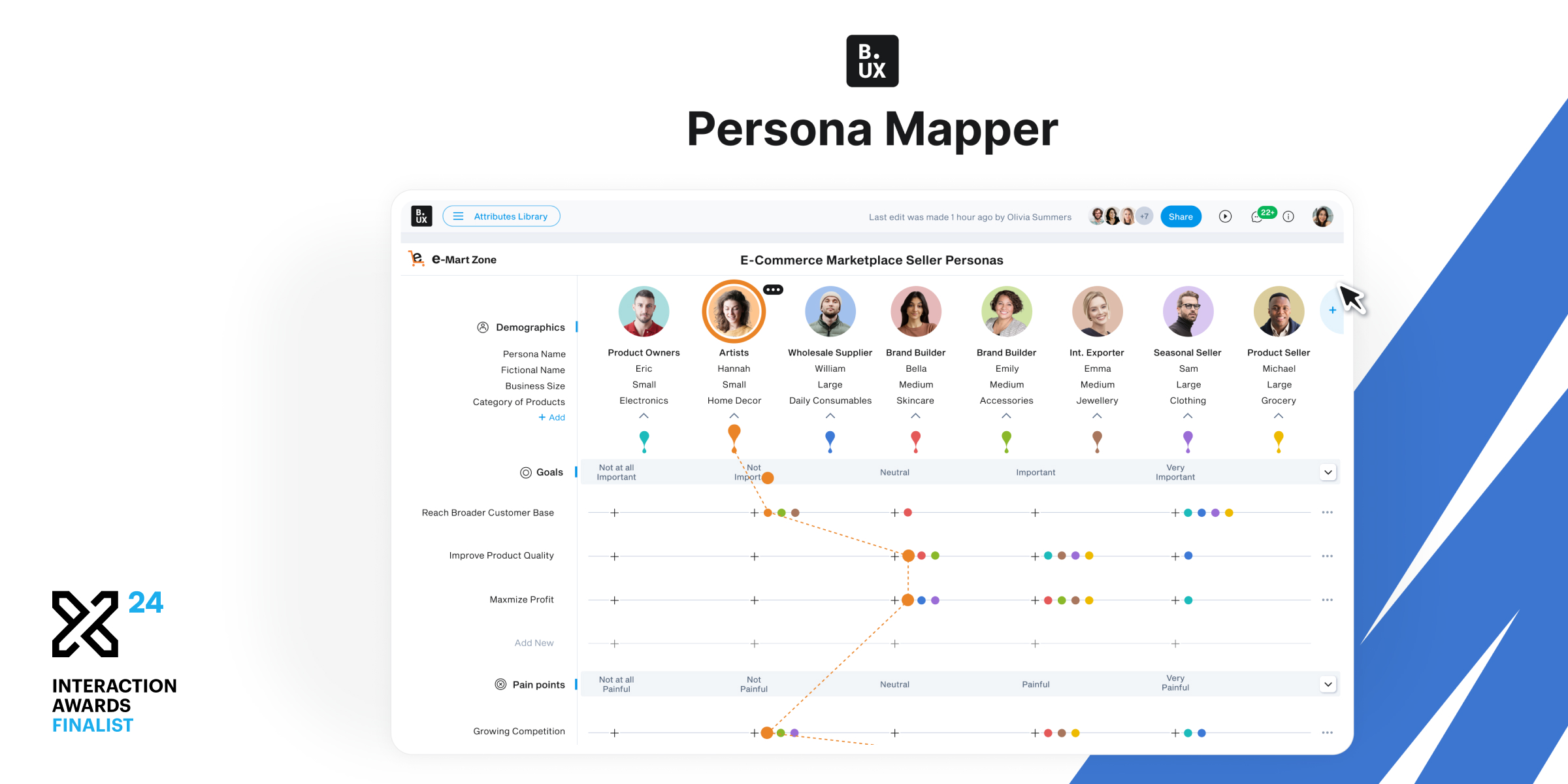
The design process which was followed always put the user at the center. The basic idea of this project came from a simple daily observation of people’s needs, and a survey was carried on trying to understand what problems were felt in relation to geographical memory, sense of direction and movement habits. It was reported, for instance, that most people think that travel times count more than real distances, and that when moving, simplicity is preferred over a shorter path. Several personas and scenarios were designed, imagining why people should use Terrarium and in which way, in order to check the credibility and potential benefit of the idea.
This process confirmed some of the initial intuitions and made the focus shift on some features as opposed to others: the project moved towards a more subjective and human-centered design, suitable for solving everyday tasks. At the same time, early prototypes and graphic drafts allowed to test the look and feel, which also developed into a friendlier icon-based interface. Every piece of Terrarium was the result of reasoning, testing and discussion which led abstract concepts to be translated into a dynamic interface.
Impact
On top of formal recognition like the MIT Technology Review Award, semifinalist status at Adobe Design Achievement Awards, acceptance at the TechPeaks international accelerator program and seed funding, the project has proven to be feasible and to have high potential, even in business terms. Building a complete prototype of the interface and subsequently an alpha version, thanks to a team of developers created inside the TechPeaks accelerator, has resulted in positive feedback from causal users as well as experts in both design and business development fields who strongly believe in the idea, supporting its development as advisors and mentors, and allowing it to evolve from an academic project into an actual startup. Present trends like the Internet of Things, smart and non-intrusive applications of ubiquitous computing, the possibilities offered by open-source Big Data and geolocation, show that the premises for human-centered development are already there. Terrarium is an example of how this shift could begin: its concept was born observing the way our mind works as opposed to the tools we currently use, and trying to adapt its design to our mental processes and intimate needs instead of trying to force the users’ behaviors into a new form.
Craft
The concept and design of Terrarium is the result of an iterative process of research, update and re-thinking, including first sketches, alternative functions that were later discarded and all the adjustments and improvements that led to the final result. It was only thanks to a well-organized task list, involving concept generation, sketches, flowcharts, wireframes, graphic drafts, scenarios and personas, that the final outcome resulted in a well-focused and consistent design. The design process also involved deep research about the opportunities and problems arising from Big Data, an exploration of the meaning and function of maps and Geographic Information Systems, and psychological studies on mental space representation, thus giving a better theoretical foundation to the concept. Finally, a working interactive prototype was developed through the Processing environment and deployed to a mobile device in order to test the actual look and feel of the application and verify the assumptions for its user experience.

