Out of the Box
Team
Company | Institution
Category
Type
Project description
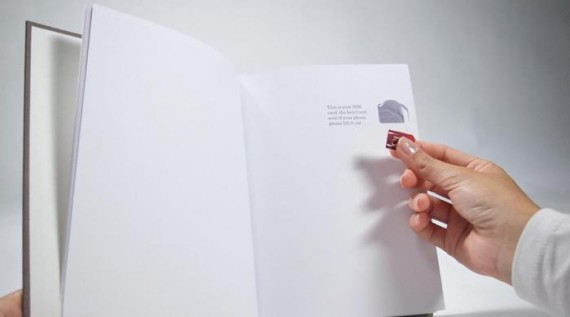
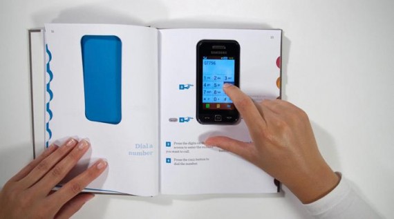
Out of the Box is a simple yet effective solution for the increasing number of cell-phone users who have difficulties with learning to use a new smartphone. For older people, this experience can be particularly frustrating as they apply analogue modes of learning to digital experiences - looking in the box for help that simply is not there. Rather than design a dumbed down “special phone”, the designers decided to look at the problem in a different way. Instead of designing another device, they looked at changing the way people learn to use them. By drawing on user strengths and familiar mental models, the designers created a set of books which would act as the packaging and provide an entire learning experience for any device. The books actually contain the phone, and use each page turn to reveal the elements of the phone in the right order, helping the user to set up the sim card, battery and even slide the case onto the phone. The phone then slots into the book, which acts as the main manual. Arrows point to the exact locations the user should press, avoiding confusion and eliminating the feeling of being lost in a menu.
Context
In the UK, the number of people over the age of 60 has taken over the number of teenagers,however technology companies are failing to address the needs of the older market.
Many of the users in this age range report problems with setting up and using their mobile phones. They find the experience frustrating and complicated and as a result will only use a limited set of functions. In an attempt to address this problem some manufacturers have created simplified handsets with only one or two basic functions to de‐clutter the experience.
We felt that older users should not be stigmatized by being offered simple products. We believe that older users should be encouraged and empowered to experience all the benefits that mobile telephones offer, just like the teenagers. Furthermore, a closer look at the current statistics reveals that in the UK alone 85% of all users are frustrated by the difficulties in setting up a new phone.
Hence this is not a problem for only older users, it is a problem for all users, and by designing user centered solutions it is possible to create a truly inclusive design solution to this problem. These Silver Phones are designed with a focus on disabilities, rather than abilities.
Impact
By empowering older users to use the same technology as younger users we have created a product and experience with an enormous social impact.
Rather than digitally excluding an entire generation of people we have created a means of enabling older users to communicate and socialise across generations by having access to the latest technology.
The solution has been designed for users of all generations, and research showed that 85% of all users could benefit from a well designed setup experience.
By providing for older users, mobile phone companies would have access to a significantly larger market.
Furthermore, because no new devices need to be manufactured, the cost to access this market would be relatively low, as only books need to be printed.
The book concept could be sold with the device inside, but there is an additional opportunity to market the book as a third party product – much like the “Dummies” manuals.
The life-cycle of the book is far greater than that of traditional packaging and manuals, as it serves as a lasting tool for learning and has been designed to occupy a physical space on a bookshelf, rather than disappear in a drawer like most boxes.
Craft
By spending time with our users, we understood that the analogue mental models associated with books were far stronger than the mental models associated with digital interfaces. We focused on the language, linearity and familiarity of books as a means of bridging this digital divide. Emotionally, the books were designed to provide simple, clear explanations without being patronising. Jargon was replaced with context and examples of what functions did. For example, instead of writing MMS we wrote: Send and receive pictures to people.
By showing the benefits of these functions, users were far more likely to spend time learning them. We used a traditional friendly tone, and designed introductions, contents pages and indexes, just like a real book.
The linearity of the book provided order, and we arranged the instructions in a specific sequence, subtlety coding them with colour, to make sure users were learning the most essential things first. By being able to see how many pages they had read, they were able to infer how much of the phone they had mastered, and how much was left to learn – something which is impossible with current devices.
Finally, the books naturally have a place, the bookshelf.

