Making Material You
Team
Company | Institution
Category
Type
Project description
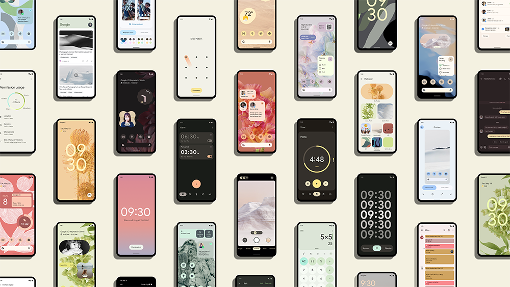
Material Design is Google’s open-source design system that serves as the foundation for Android 13. Our latest version, Material You, enables designers and developers to easily build beautiful, usable interfaces. In reimagining the interaction patterns and visual language of Material Design, the team wanted to expand the discourse of design systems beyond usability and consistency, ultimately asking: what if form followed feeling? When we created Material You, we explored possibilities and polarities of scalable UI systems, arriving at more flexible color, shape, typography, and motion ranges for app makers to build with. The new system is expressive and surprising, without compromising UX best practices. To make our system feel more alive and customizable, we tested the limits of conventional UX beliefs – those long held beliefs and modernist paradigms, such as predictable = usable, and we pushed on inherited one-size-fits-all models for manufacturing hardware and software. The team that made Material You imagined a system for adaptable, expressive, personal experiences that work for you…whomever “you” are.
When we started designing Material You, we all wanted to pick that perfect new color palette. For some of the design team, that meant vibrant and bold hues; for others, that meant monochrome and subdued palettes. We were all working from home through the pandemic, connecting virtually and spread across multiple continents.
In evolving Google’s open-source design system, we asked questions that challenged the conventional relationship of a designer and an end-user. We asked why design as if everyone experiences color the same way… We asked what if instead of form following function, form followed feeling? On a basic level, we were asking how we could make personal devices feel truly personal?
Our team realized that the biggest opportunity (and the biggest challenge) was to design a system that’s flexible enough to allow any user to become a co-creator in their experience, without compromising fundamental interaction principles of usability and accessibility. It represented a break from the last ten years of how we approached user experience design; After all, Google is a company known for data-driven decisions, like analyzing forty shades of blue to find the perfect one for our “average user.”
But, what we know now, and spent the past two years exploring, is that maybe individuals know themselves better than a design team or its data ever can. Moreover, we wanted to build from the premise that what some find beautiful, others may dislike; the settings that improve accessibility for some, can make experiences worse for others. Finding averages to fit individuals wasn’t working anymore.
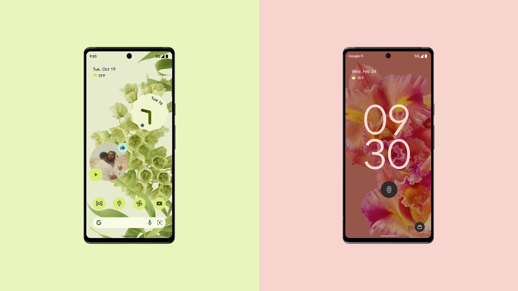
Designing Material You meant defining a framework for co-creation such that individuals can manage their experience of shape, motion, color, typography, and UI components. This also meant accepting that our voice as designers and Google’s brand identity sometimes needs to take a backseat to user expression and creativity. We needed to make space for our users by creating new and sometimes unexpected system-wide levers for personal expression.
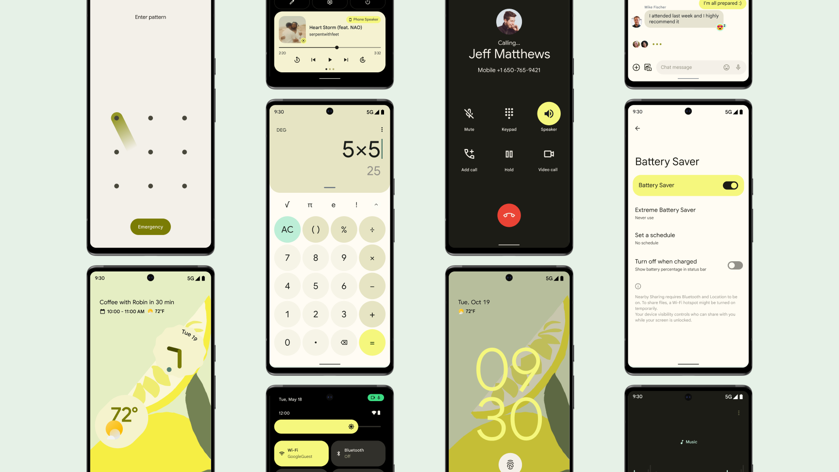
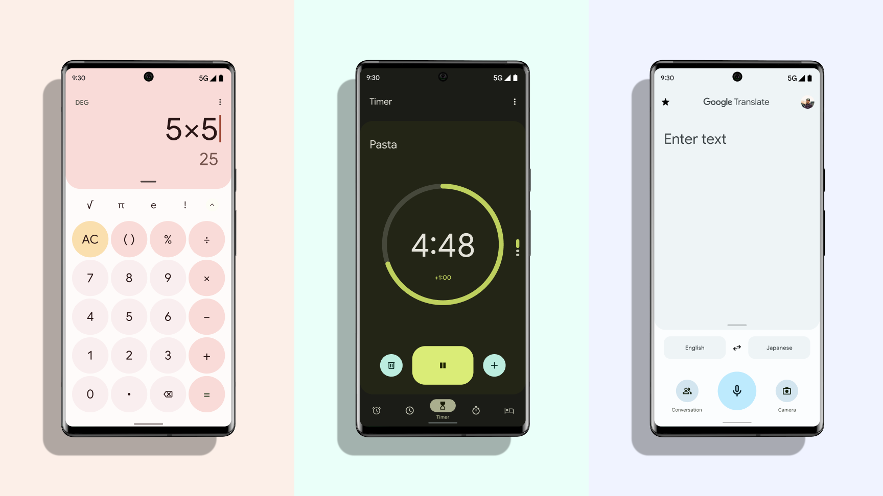
The dynamic color system, for example, allows anyone to match their system UI colors to an image of their choice. We introduced variable fonts to increase the adaptability of typography for both expression and individual needs around legibility. Our components are more flexible to allow for ranges in a person’s mobility and dexterity, while also introducing moments of expressiveness in the interaction state shape change or ripple-like cascades of light from a charging function.

.jpg)
